

.svg)
 Healthcare
 Finance
 Retail
 SaaS & Digital
 eCommerce
 Education
 Salesforce
  HubSpot
 Pipedrive
 Mailchimp
 Klaviyo
 Zendesk
  Intercom
 Freshdesk
 HelpScout
  Front
Front Jira
Jira Slack
Slack  MS Teams
 Zoom
Zoom Google Sheets
  Zapier
  Integrately
 Make
Make  Webhooks




 MS Teams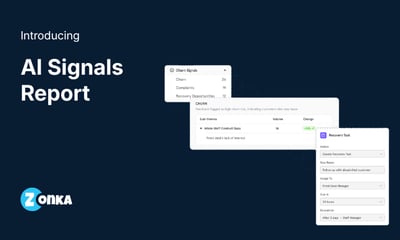

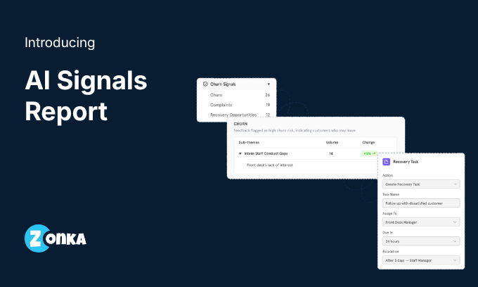


The gap in most CX programs isn't feedback collection. It isn't even theme detection or sentiment scoring. It's the step that comes after. The one where someone looks at a report full of data and still has to figure out what changed, where the risk is, and what to do next.
Dashboards and reports get you close. They show you themes, sentiment, volume. But they don't classify what you're looking at. They don't tell you which sub-theme just appeared for the first time, which one is growing fast, where customers are signalling they might leave, or where their words and scores are telling different stories. That layer of intelligence has always been left to the person reading the report.
AI Signals is our answer to that. A report that doesn't wait for you to find the signal. It surfaces the signal and asks you what you want to do about it.
What AI Signals Surfaces
AI Signals sits as a new tab inside Intelligence Hub, alongside Snapshot and Deep Dive. It reads the same data your thematic analysis has already processed and organises it into five distinct views, each answering a different question. Everything works out of the box. No signal rules to define. No thresholds to configure.
1. Key Drivers
This is the starting point for most teams. Key Drivers shows the sub-themes that are shaping your customer experience right now, and it splits them into five views: Trending, Positive, Negative, New, and Emerging.
Each view answers a different version of "what should I pay attention to?" New shows sub-themes that appeared for the first time this period, things your customers weren't talking about before. Emerging shows sub-themes where volume is climbing. Negative shows where sentiment is pulling down. Every row carries its volume, sentiment score, and change versus the previous period, so you're always seeing movement, not just a static list.
2. Feedback Queries
This one is built for product teams. Feedback Queries isolates two specific types of feedback: Suggestions and Questions & Requests. These are phrases where customers aren't complaining or praising. They're telling you what they want next or asking something your docs didn't answer.
For product managers, the Suggestions view is a direct line into what your users are asking you to build. For support leads, the Questions view is a map of knowledge base gaps. Both are sorted by volume so you see the most common asks first.
3. Churn Signals
Three views here: Churn, Complaints, and Recovery Opportunities. Churn isolates phrases where the AI has tagged high churn risk. Complaints pulls every phrase classified as a complaint, grouped by sub-theme. Recovery Opportunities surfaces signals where a save is still possible, the customers who are unhappy but haven't left yet.
This is the widget where timing matters most. A churn signal that sits in a spreadsheet for two weeks is a churn signal that arrived too late. AI Signals makes qualitative analysis for churn detection something that happens automatically, inside the same report your team already checks. That's the difference between catching it and reading about it in a cancellation note.
4. Praise & Recommendations
Not every signal is a problem. Praise surfaces the sub-themes where customers are expressing genuine appreciation. Recommend shows where they're actively telling others to use your product. These are your strongest advocacy signals, and they tend to get overlooked when teams are focused on fixing what's broken.
For marketing teams, this is where testimonial candidates, case study angles, and campaign messaging come from. For CX leaders, it's confirmation of what's actually working, not just what the team assumes is working.
5. Mixed Signals
This is the one I find most interesting. Mixed Signals flags responses where the sentiment in the comment contradicts the score the customer gave. A customer writes something positive but scores you a 3 out of 10. Or they write a complaint but give you a 9. Both happen more often than most teams realise, and they point to something worth investigating.
Sometimes it's a misunderstanding of the scale. Sometimes it's a customer being polite in words but honest in the number, or the other way around. Either way, it's a blind spot in your data, and this widget makes sure you see it instead of averaging it away. Mixed Signals only appears when contradictions exist in your data. If there are none, the widget stays hidden.
Act on Signals Without Leaving the Report
Here's what typically happens. Someone spots a churn cluster growing in a sub-theme. They switch to email to flag it. They open a task manager to assign follow-up. They copy context from one tool into another. The analysis happened in one place. The action happened somewhere else. That friction meant a lot of signals got noted and never acted on.
AI Signal removes that friction. Every sub-theme and every phrase has an action bar attached to it. You can send an email, post to Slack, post to Microsoft Teams, create a task, or create a ticket, all directly from the row you're looking at. The action bar pre-populates the context, sub-theme name, phrase text, source, signal type, so the person receiving it has everything they need without going back to the report.
We built this as a reusable component, which means it will extend to Deep Dive and other surfaces in the future. But AI Signals is where it launches first, because signals without actions are just observations.
Pre-Built, Not Configured
There's a design choice behind AI Signals that I want to call out, because it shapes the entire experience. Nothing in this report requires setup.
Most analytics platforms that offer signal detection ask you to define rules first. Flag a sub-theme when volume increases by 20%. Alert me when sentiment drops below a threshold. That approach works for teams with dedicated analysts who know what they're looking for. It doesn't work for the majority of CX, product, and support teams who need the analysis done for them.
AI Signals takes the opposite approach. The five widgets are pre-built. The classification, churn risk, intent, sentiment, and other experience signals, is already done by Zonka Feedback's AI engine as part of the feedback intelligence framework. The temporal comparison runs automatically against the previous period. You open the tab and the signals are there. No rules to write. No thresholds to tune. No analyst required.
That was a deliberate product decision. The teams who need this feature most are exactly the teams who don't have time to configure it.
Three Tabs, One Story
Snapshot, Deep Dive, and AI Signals are now three layers of the same data, each answering a progressively deeper question.
Snapshot tells you how things look overall. Deep Dive tells you what customers are talking about. AI Signals tells you what changed, where the risk is, and what to do next. The filters carry across all three, so switching tabs feels like zooming in, not starting over.
That's the Intelligence Hub we set out to build. Not three disconnected reports. One continuous path from seeing your numbers to understanding your themes to acting on the signals underneath them.
Analysis Should Happen for You, Not by You
Every product feature is a bet on where your users' time is better spent. With AI Signals, the bet is straightforward. Your CX team's time is better spent acting on churn signals than finding them. Your product team's time is better spent prioritising suggestions than exporting spreadsheets to discover them. Your support team's time is better spent closing knowledge gaps than scrolling through phrases to identify them.
The analysis was always possible. It just cost too many hours, so it didn't happen. Now it happens every time someone opens the tab.
If you're running Intelligence Hub and haven't explored the AI Signals tab yet, it's already there in your project. If you're evaluating Zonka Feedback and want to see how AI Signals works with your own data, book a demo and we'll walk you through it.

.png)
.png)
.png)