.svg)
 Healthcare
 Finance
 Retail
 SaaS & Digital
 eCommerce
 Education

 Salesforce
  HubSpot
 Pipedrive
 Mailchimp
 Zendesk
  Freshdesk
 HelpScout
  Front
Front Slack
Slack  Zoom
Zoom Google Sheets
  Zapier
  Integrately
 Webhooks
  Blogs
Blogs Webinar
 Product Updates


TL;DR
- The 12 metrics that actually predict retention in SaaS today span four categories: Loyalty & Satisfaction (NPS, CSAT, CES), Retention & Revenue (Retention Rate, Churn Rate, MRR, NRR, CLV), Product Usage (Activation Rate, Time to Value, Feature Adoption), and Growth (Free-to-Paid Conversion).
- Subscription-era metrics alone (MRR, churn rate, retention rate) miss what predicts renewal in product-led SaaS. PLG-era metrics fill that gap.
- Net Revenue Retention is the single most-cited SaaS metric in 2026. Boards anchor valuations on it more than top-line growth.
- Every metric in this guide includes a formula, a 2026 benchmark, and guidance on which stage it belongs to.
- You don't need all 12. Pick the 3–5 that match your GTM motion.
The customer success metrics stack most SaaS teams run today was built for a different product. MRR. Churn rate. CLV. Maybe NPS. Maybe CSAT. Solid metrics. Good math. Still useful.
They just don't tell you what they used to.
The shift is structural. Subscription-era metrics were built on the assumption that revenue tracks seat count and seat count tracks contracts. Product-led growth broke that assumption. Revenue now tracks usage. Usage tracks activation. Activation tracks whether the user ever hits their aha moment, which most dashboards don't measure. So a CS team can have 90% logo retention, a healthy MRR, and a respectable NPS score, and still shrink 8% annually because NRR is 92% and nobody noticed.
The 12 metrics below are the ones that actually predict retention in a 2026 SaaS business. Formulas, benchmarks, which ones matter at which stage. The full comparison table comes next.
The 12 SaaS Customer Success Metrics at a Glance
| Metric | What It Measures | Formula | 2026 SaaS Benchmark | Best Stage |
| NPS | Loyalty, likelihood to recommend | %Promoters − %Detractors | B2B avg: 30–40 · Excellent: 50+ | All stages |
| CSAT | Satisfaction at a touchpoint | (Sum / Max Score) × 100 | 80%+ healthy · 90%+ excellent | All stages |
| CES | Effort to complete a task | Avg of 7-point scale | 5+ out of 7 | Post-support, post-onboarding |
| Retention Rate | % of customers retained | ((End − New) / Start) × 100 | 90%+ annual B2B SaaS | Growth + Mature |
| Logo Churn Rate | % of customers who cancel | Churned / Start × 100 | <5% monthly SMB · <1% enterprise | All stages |
| Revenue Churn Rate | MRR lost to cancellations | Churned MRR / Start MRR × 100 | <5% monthly · <1% enterprise | Growth + Mature |
| MRR | Monthly recurring revenue | Sum of active subscriptions | Series A: 10–20% MoM growth | Growth + Mature |
| NRR | Revenue retention incl. expansion | (Start + Expansion − Contraction − Churn) / Start × 100 | 100% flat · 110%+ healthy · 130%+ best-in-class | Growth + Mature |
| CLV | Total revenue per customer lifetime | Avg Purchase × Purchases/yr × Lifetime | Only useful paired with CAC (3:1 healthy) | All stages |
| Activation Rate | % hitting aha moment | Activated / Signups × 100 | 20–40% typical | All (critical for PLG) |
| Time to Value | Time to first meaningful outcome | Measured in days | <7 days self-serve · <30 days sales-led | Early + Growth |
| Feature Adoption | % of users using a feature | Feature Users / Active Users × 100 | 25–50% within 3 months of launch | Growth + Mature |
| Free-to-Paid Conversion | Free users who convert | Converted / Total × 100 | Freemium: 2–5% · Trial: 15–25% | PLG companies |
Which Metrics Matter at Which Stage
Every new CS leader inherits a dashboard. And every new CS leader rebuilds it. The question is which metrics stay on the rebuild and which ones get cut. The answer depends less on SaaS-as-a-category and more on where your company is in its growth arc.
Seed / Early-Stage SaaS
Primary metrics: Activation Rate, NPS, Churn Rate.
You don't need NRR yet. You need evidence that users reach the aha moment and stick. Before ARR growth means anything, activation tells you whether the product works. NPS tells you whether users will bring others. Churn tells you whether they stay. That's it. Three metrics. Ignore the rest.
Growth-Stage SaaS (Series A → B)
Primary metrics: NRR, CLV:CAC, Feature Adoption, CSAT.
This is where investors start caring about compounding retention. NRR proves the engine works even without new logos. CLV:CAC proves the unit economics hold. Feature adoption tells you what to build next. CSAT catches friction before it becomes a churn event.
Mature SaaS
Primary metrics: NRR, NPS, Customer Health Score, MRR/ARR trajectory.
The focus shifts to expansion and enterprise protection. Enterprise churn is rare. Catastrophic when it happens. Health scores catch the early signal. NPS at this stage tracks brand strength and reference-ability, not just satisfaction.
The PLG Overlay (Applies at Any Stage)
Primary metrics: Activation Rate, TTV, Feature Adoption, Free-to-Paid Conversion, PQLs.
In product-led growth, the product IS the sales motion. Which means the metrics that matter most aren't the ones salespeople used to hit. They're the ones the product itself generates. Watch these even if you're sales-led. They flag problems upstream of revenue.
The metric-by-metric breakdown follows. Each one includes formula, benchmark, and the moments where it actually earns its place on the dashboard. For the wider feedback program these metrics plug into, we've covered that ground in our complete SaaS feedback management guide.
Category 1: Loyalty & Satisfaction Metrics
1. Net Promoter Score (NPS)
NPS measures customer loyalty by asking how likely a customer is to recommend your product on a 0–10 scale. Respondents split into three groups: Promoters (9–10), Passives (7–8), and Detractors (0–6). The metric was developed by Fred Reichheld, Bain & Company, and Satmetrix in 2003 and has held up because it does one thing well — it predicts organic growth through word of mouth.
The main survey question is the one that started it all:
How likely are you to recommend our product to your friends and colleagues?
Promoters (9–10) are loyal. They stay, they refer, they forgive small mistakes.
Passives (7–8) are satisfied but switchable. A better offer moves them.
Detractors (0–6) are unhappy and talk about it. Left unattended, they churn and warn others away.
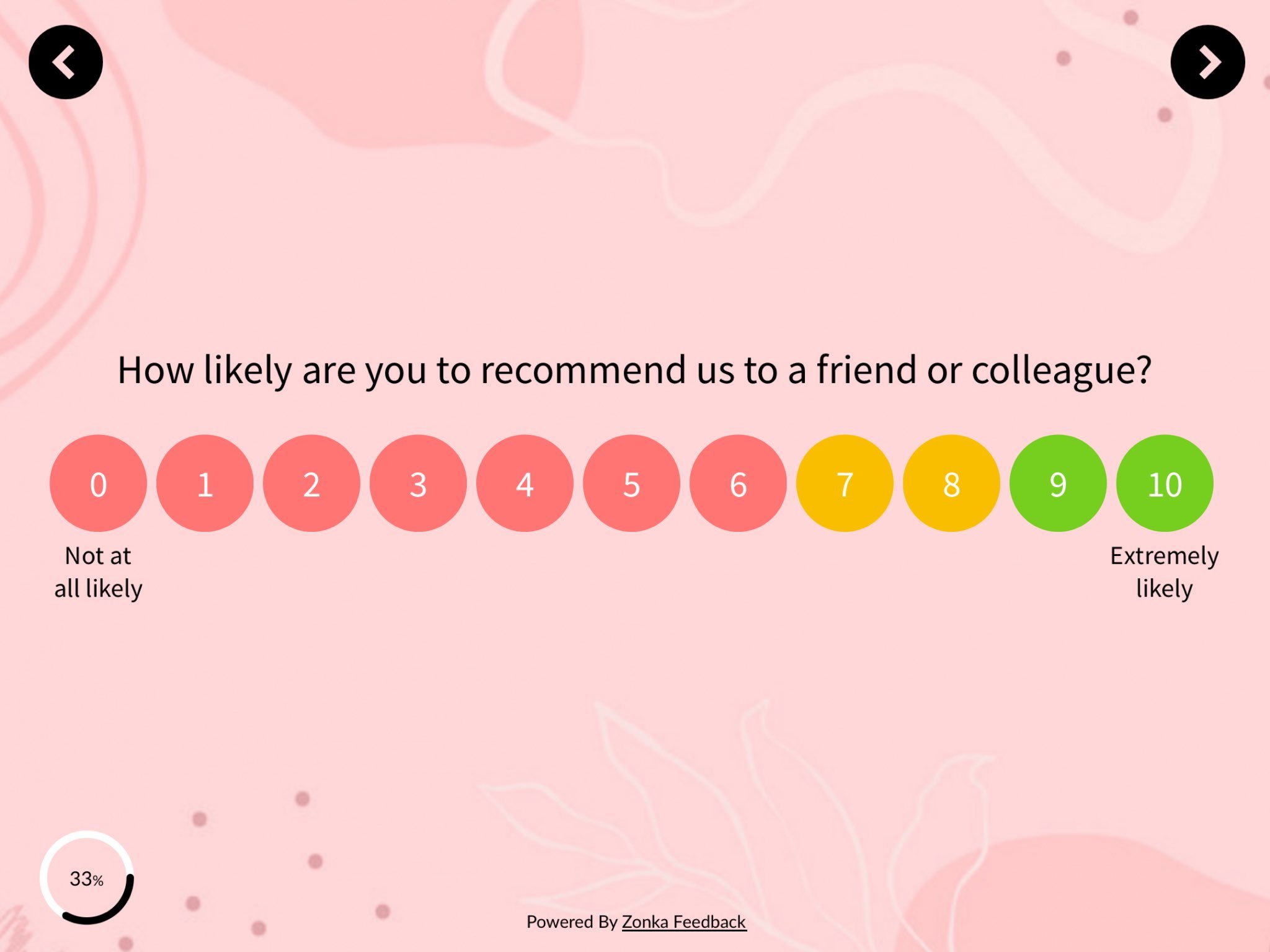
How to Calculate NPS
%Promoters = (Promoters / Total Respondents) × 100
%Detractors = (Detractors / Total Respondents) × 100
NPS = %Promoters − %Detractors
So if 200 of your 230 customers respond, with 100 Promoters, 50 Passives, and 50 Detractors, your NPS is 50% − 25% = 25. The score ranges from −100 to +100.
What's a Good NPS for SaaS?
| Score | Signal |
| Below 0 | Red flag, PMF issues |
| 0–30 | Room to grow |
| 30–40 | B2B SaaS average |
| 50+ | Excellent |
| 70+ | World-class (Slack, Atlassian tier) |
SMB SaaS tools generally score higher than enterprise platforms. Transactional NPS runs lower than relational NPS. Don't compare your post-support NPS to your annual relational NPS and think something broke.
One of our customers, SmartBuyGlasses, the global eyewear e-commerce company operating across 30+ countries, increased their NPS by 30% after unifying their feedback program. The lift wasn't from a better survey. It was from acting on what the survey surfaced. That's the pattern. NPS doesn't move because you ask better questions. It moves because you do something with the answers.
For the mechanics of running NPS in a SaaS context, we've covered how to measure NPS in SaaS and rounded up the NPS tools for SaaS worth evaluating. If you're picking NPS survey software from scratch, start there.
2. Customer Satisfaction (CSAT) Score
CSAT measures satisfaction with a specific interaction or feature. It's the metric that fires after something happens: a support ticket closes, a feature ships, an onboarding step completes. Where NPS tracks overall loyalty, CSAT tracks a moment.
The standard question:
How satisfied were you with [X]?
Scale is typically 1–5, sometimes 1–7 or a smiley/star variant.
How to Calculate CSAT
CSAT = (Sum of Scores / Maximum Possible Score) × 100
Or, more commonly in SaaS: CSAT = (% of respondents scoring 4 or 5) × 100.
Benchmark
SaaS CSAT averages around 80%. 90%+ is excellent. Support CSAT benchmarks run higher than product CSAT. A well-run support org can hit 92–95% without heroics.
The teams getting CSAT right at scale run it the same way: different widgets on different page types, not a single blanket site-wide survey. A CSAT moment after onboarding finishes. A different one after a support ticket closes. A different one again after a feature is used for the third time. The principle: CSAT collected at the wrong moment tells you very little. CSAT collected right after a specific action tells you everything.
When to Use CSAT vs. NPS
| CSAT | NPS | |
| What it measures | Satisfaction at a moment | Overall loyalty |
| Cadence | Post-event | Quarterly or annual |
| Best for | Onboarding, support, feature rollout | Relationship health, reference risk |
| Scale | 1–5 typically | 0–10 |
Use both. They answer different questions.
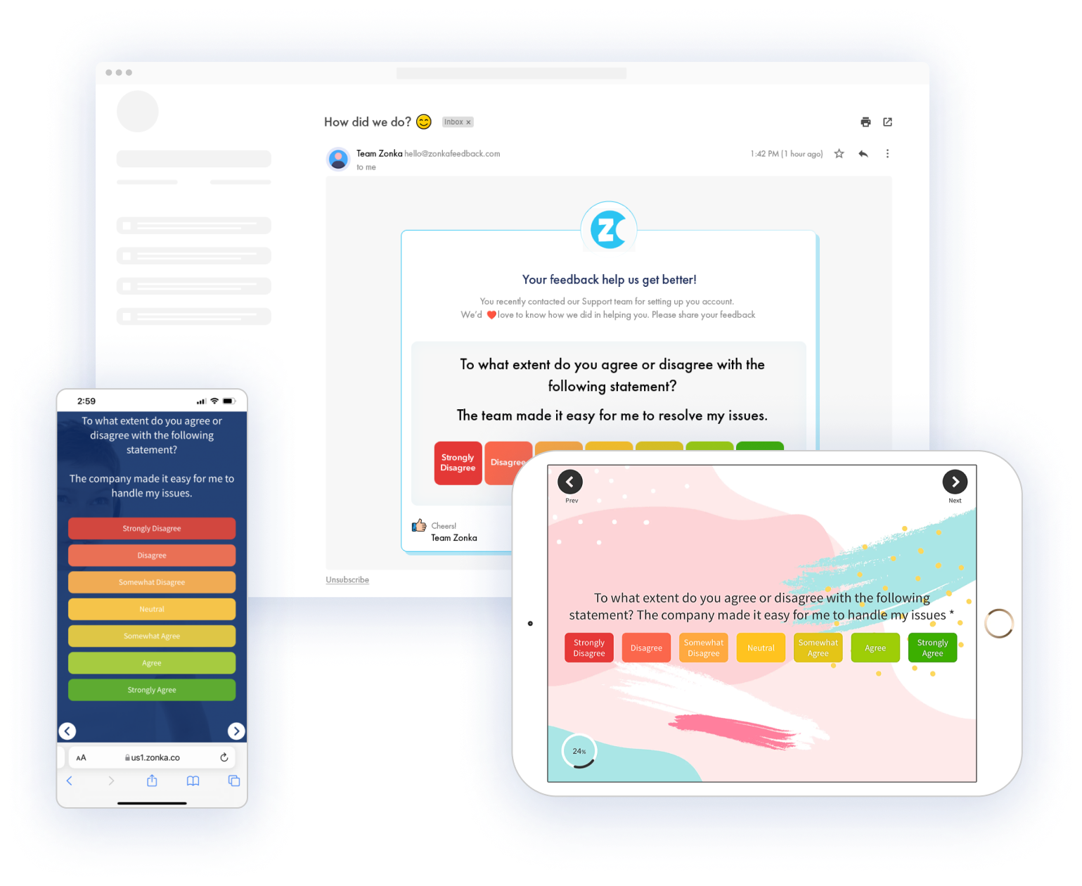
3. Customer Effort Score (CES)
CES measures how much effort a customer had to put in to complete a task. Where CSAT asks "were you satisfied?" and NPS asks "would you recommend?", CES asks the more predictive question: "was that easy or hard?"
The classic CES statement, rated on a 7-point agree/disagree scale:
The company made it easy for me to handle my issue.
Scale: Strongly Disagree → Disagree → Somewhat Disagree → Neutral → Somewhat Agree → Agree → Strongly Agree.
How to Calculate CES
CES = Sum of All Responses / Number of Responses
Benchmark
Target 5+ on a 7-point scale. But the more useful benchmark is the delta over time. CES is a friction metric. It only matters if it's moving in the right direction.
Research from CEB (now Gartner) found that effort predicts loyalty and renewal better than satisfaction for support interactions. Low effort creates repeat buyers. High effort creates quiet churn. Which is why CES is the right metric for post-support, post-onboarding, and post-key-task moments. Those are the friction-dense moments in a SaaS lifecycle.
A few places CES pays off:
- After onboarding completes (or stalls)
- After a support ticket closes
- After a user completes a high-effort task (export, setup, integration)
- After a new feature's first use
If you're setting up CES after onboarding, our SaaS onboarding survey template plugs into most product flows without requiring a custom build.
Category 2: Retention & Revenue Metrics
4. Customer Retention Rate
Customer Retention Rate is the percentage of customers you hold onto across a defined period, usually a year. It's the inverse of churn rate and the simplest measure of whether your product is sticky.
How to Calculate Customer Retention Rate
Retention Rate = ((End-of-Period Customers − New Customers) / Start-of-Period Customers) × 100
Worked Example
Start the year with 200 customers. Acquire 40 new ones. End the year with 220. Retention Rate = ((220 − 40) / 200) × 100 = 90%.
Benchmark
B2B SaaS healthy retention sits at 90%+ annual. Enterprise targets run higher. 95%+ is the bar for accounts over $100K ACV. Below 80% annual retention in B2B SaaS signals a bigger problem than the CS team alone can solve.
Retention Rate tracks logos, not revenue. A high retention rate can still mask revenue problems if the customers staying are downgrading. That's what revenue retention catches.
5. Customer Churn Rate: Logo vs. Revenue
Customer Churn Rate measures the rate of customer attrition. It's the percentage of customers who stopped using your product in a period. The problem with churn as a single number is that a small customer canceling and an enterprise account canceling don't mean the same thing. Modern SaaS CS teams split churn into two versions.
Logo Churn Rate (Customer Count)
Logo Churn Rate = (Customers Churned / Customers at Period Start) × 100
Example: 200 customers at the start of the month. 10 cancel. Logo churn = 5%.
Revenue Churn Rate (MRR Impact)
Revenue Churn Rate = (Churned MRR / Starting MRR) × 100
Example: $100K MRR at the start of the month. $3K cancels. Revenue churn = 3%.
Why the Distinction Matters
You can have 5% logo churn that wipes out 15% of your MRR if the customers who left were your largest. Or 10% logo churn that barely touches revenue because the churning customers were on the lowest tier. Logo churn tells you about product fit. Revenue churn tells you about business impact. Track both.
Benchmarks
| Segment | Monthly Logo Churn | Monthly Revenue Churn |
| SMB SaaS | 3–5% acceptable | 3–5% acceptable |
| Mid-market | 1–2% healthy | 1–2% healthy |
| Enterprise | <1% healthy | <1% ideal |
Annual logo churn for B2B SaaS should sit under 10%. Under 5% is excellent.
A note on involuntary churn: payment failures, expired cards, billing errors. It's 20–40% of total churn in many SaaS companies and it's fixable with dunning. Don't let your CS team take the hit for what's really a billing problem.
Whatever churn your team catches, the follow-up is where retention actually happens. Which is why closing the customer feedback loop on at-risk accounts matters more than the churn number itself.
6. Monthly Recurring Revenue (MRR)
MRR is the total predictable, subscription-based revenue your product generates in a month. It's the heartbeat number of SaaS finance. The trick is that MRR is never a single number. It's a composition.
The Components of MRR
- New MRR: revenue from new customers this period
- Expansion MRR: upgrades, upsells, seat additions from existing customers
- Contraction MRR: downgrades (customers still active, paying less)
- Churned MRR: revenue lost from cancellations
Net New MRR Formula
Net New MRR = New MRR + Expansion MRR − Contraction MRR − Churned MRR
That's the real growth number. Top-line MRR growth looks healthy until you realize expansion is the only thing keeping it positive and new logo growth flattened three quarters ago.
MRR vs. ARR
| MRR | ARR | |
| What it is | Monthly recurring revenue | Annual recurring revenue |
| Best for | Operational visibility | Board reporting, valuation |
| Formula | Sum of active monthly subscriptions | MRR × 12 |
Most SaaS companies track both. Use MRR day-to-day. Use ARR when someone's asking about the business at a board level.
MRR Growth Benchmarks
| Stage | MoM MRR Growth |
| Seed / Series A | 10–20% |
| Series B+ | 5–10% |
| Mature SaaS | 1–3% |
As companies mature, MRR growth slows. NRR becomes the more important metric, because growth has to come from existing customers.
7. Net Revenue Retention (NRR)
Net Revenue Retention measures how much revenue you retain from an existing customer cohort over a period, including expansion and minus downgrades and churn. If NRR is above 100%, your business grows from existing customers alone — even with zero new logos.
That last sentence is the reason NRR drives SaaS valuations more than any other single metric in 2026.
How to Calculate NRR
NRR = ((Starting MRR + Expansion MRR − Contraction MRR − Churned MRR) / Starting MRR) × 100
Worked Example
Start the month with $100K MRR from an existing cohort. That cohort adds $20K through expansion. Loses $3K to downgrades. Loses $5K to churn.
NRR = (100 + 20 − 3 − 5) / 100 × 100 = 112%.
You grew 12% from existing customers alone. That's compounding retention. Keep that rate going for three years and revenue nearly doubles without any new customer acquisition.
NRR Benchmarks
| NRR | Signal |
| Below 90% | Serious retention problem |
| 90–100% | Churn outpacing expansion |
| 100% | Flat; expansion exactly offsets churn |
| 110%+ | Healthy B2B SaaS |
| 120–130% | Best-in-class |
| 140%+ | IPO-tier (Snowflake, Datadog at peak) |
OpenView's SaaS Benchmarks Report tracks NRR across hundreds of companies annually. Worth reading the latest version before setting your own target.
NRR vs. GRR
Gross Revenue Retention (GRR) strips out expansion to show pure retention. GRR is always equal to or lower than NRR. Healthy B2B SaaS GRR sits at 90%+. Best-in-class is 95%+.
The pair matters. NRR alone can hide a churn problem if expansion is masking it. GRR exposes the underlying retention number. Watch both.
8. Customer Lifetime Value (CLV)
Customer Lifetime Value is the total revenue a customer brings over the full length of their relationship with your company. It tells you how much a customer is actually worth, and therefore how much you can afford to spend acquiring one.
How to Calculate CLV
CLV = Average Purchase Value × Purchases per Year × Average Customer Lifetime
So if your customer pays $100/month (12 purchases per year) and stays an average of 5 years:
CLV = $100 × 12 × 5 = $6,000
The Number That Actually Matters: CLV:CAC
CLV by itself is vanity. CLV paired with Customer Acquisition Cost (CAC) is operational.
| CLV:CAC | What It Means |
| 1:1 | You're losing money on every customer |
| 3:1 | Healthy |
| 5:1 | Excellent |
| Above 5:1 | You're probably under-investing in growth |
The 3:1 ratio comes from David Skok's work at Matrix Partners and has held up remarkably well as a SaaS benchmark for over a decade.
CAC Payback Period (The Bonus Metric)
How many months it takes to recover customer acquisition cost through gross margin. Healthy SaaS: under 12 months. Excellent: under 6. PLG companies often hit under 3 because acquisition is low-cost by design.
CLV changes in PLG. Freemium and trial models usually have shorter payback periods but lower per-customer CLV, compensated by volume.
Category 3: Product Usage Metrics (PLG)
9. Activation Rate
Activation Rate is the percentage of new users who reach the "activation milestone," the aha moment where the product's value clicks, within a defined time window. It's the most predictive metric in PLG SaaS. Users who activate retain 5–10x better than users who don't.
The hard part is defining your activation milestone. It's product-specific:
- Slack: first team sends 2,000+ messages
- Dropbox: first file uploaded
- Figma: first design shared with a collaborator
- Zoom: first meeting completed with 2+ participants
- Canva: first design exported
Notice the pattern. It's never "completed signup." It's always "did the thing the product is actually for." Signup is a funnel step. Activation is a value moment.
How to Calculate Activation Rate
Activation Rate = (Users Who Hit Milestone / Total New Signups) × 100
Benchmark
20–40% typical across SaaS. Self-serve SaaS with clear value prop can hit 50%+. Complex enterprise tools often sit under 20%. The benchmark matters less than the trend. Whether yours is going up or down over time.
How to Improve It
Three moves that consistently work:
- Remove steps between signup and the aha moment
- Add in-product prompts at the friction points
- Survey users who didn't activate. Ask why.
That third one is where in-app feedback does the heavy lifting. Quantitative analytics tell you users dropped at step 3. Qualitative feedback tells you why.
10. Time to Value (TTV)
Time to Value is the gap between account creation and the user achieving their first meaningful outcome. Shorter is almost always better. Every day between signup and value is a day the user might quit.
Variants include Time to First Value (first meaningful action) and Time to Wow (the moment the user thinks "oh, this is actually useful"). Different products measure different things. Pick one and stick with it.
Benchmark
| Motion | Target TTV |
| Self-serve SaaS | Under 7 days, ideally under 1 day |
| Sales-led SaaS | Under 30 days |
| Enterprise implementation | Under 90 days |
Why It Matters
TTV compounds. Shorter TTV leads to higher activation. Higher activation leads to higher retention. Higher retention lifts NRR. It's the earliest lever in the chain. Move TTV from 14 days to 3 days and you don't just improve one metric. You improve everything downstream.
How to measure it:
- Define the value moment (same as activation milestone, often)
- Measure the time from account creation to that event
- Segment by acquisition channel, plan tier, company size
- Compare segments. The gaps are where the problem lives.
11. Feature Adoption Rate
Feature Adoption Rate is the percentage of active users engaging with a specific feature. It's the metric product teams use to decide what to invest in, what to ship, and what to kill.
How to Calculate Feature Adoption
Feature Adoption Rate = (Active Users of Feature / Total Active Users) × 100
Benchmark
| Feature Type | Adoption at 3 Months |
| Core features | 60%+ (or question why they exist) |
| Supporting features | 25–50% typical |
| Power-user features | 10–25% by design |
| New feature post-launch | 25–50% target |
If adoption stays under 10% six months after launch, the feature has three options: redesign, reposition, or sunset. Low adoption isn't always a feature problem — often it's a discoverability problem. Which is why the qualitative layer matters.
Run a short CES survey after a user's third interaction with a feature. "How easy was that?" combined with a free-text follow-up surfaces whether adoption is blocked by design, by onboarding, or by something else entirely. Product analytics tools like Mixpanel and Amplitude tell you whether users adopted. In-product feedback tells you why.
Category 4: Growth & Conversion
12. Free-to-Paid Conversion Rate
Free-to-Paid Conversion is the percentage of free users who upgrade to a paid plan. For any SaaS with a freemium or free trial motion, it's the metric that turns product usage into revenue.
How to Calculate Free-to-Paid Conversion
Free-to-Paid Conversion = (Converted Users / Total Free Users) × 100
Benchmarks
| Motion | Typical | Excellent |
| Freemium (forever-free tier) | 2–5% | 5–10% (Slack, Zoom at peak) |
| Free trial, self-serve | 15–25% | 25%+ |
| Free trial, sales-assisted | 25–40% | 40–60% |
The Funnel Inside the Funnel
Conversion is rarely one step. It's a funnel inside the funnel:
- Signup → Activation
- Activation → Regular Use
- Regular Use → Paid
Most teams try to optimize step 3. The actual bottleneck is usually step 1. If only 25% of signups ever activate, step 3 optimization has a ceiling no amount of paywall tweaking can break.
PQLs (Product Qualified Leads)
Users who show buying intent through product behavior: hit usage limits, invite teammates, explore pricing pages. PQLs convert 3–5x better than MQLs in PLG companies. If your sales team is working MQLs and ignoring PQLs, they're working the wrong list.
Bonus: Customer Health Score
Customer Health Score is a composite metric that combines product usage, engagement, feedback, and commercial signals into a single predictive number. Every modern CS team eventually builds one. Most start simple and iterate.
Typical Inputs
- Product usage: login frequency, feature adoption, DAU/MAU trend
- Feedback signals: NPS, CSAT trend, sentiment in open-text
- Support signals: ticket volume, resolution time, escalations
- Commercial: contract size, renewal proximity, payment history
How to Build One
- Start with 3–5 inputs. Not 15.
- Weight them equally to start
- Validate against actual renewal and churn outcomes over 1–2 quarters
- Re-weight based on what actually predicted correctly
- Iterate
The first version is always wrong. The discipline is iteration.
Benchmark
There isn't a universal one. Health scores are tuned per business. Target a model that accurately predicts renewal or churn at 70%+ on known historical data. Below that, the score is noise.
The signal that fires earliest in most health score models? Feedback sentiment. A Promoter who turns Passive is often a month ahead of the usage data that would have caught the same account drifting.
Building Your CS Metrics Dashboard
Most CS teams try to track everything. Most would be better off tracking five things well. Start with 3–5 metrics, not 12. Every metric needs an owner, a cadence, and an action tied to it. Metrics with no action attached are dashboard decoration.
Pair leading indicators with lagging indicators:
- Leading: activation, feature adoption, NPS trend
- Lagging: churn, NRR, revenue growth
Leading tells you what's coming. Lagging confirms it happened. If your dashboard is all lagging indicators, you're driving by the rearview mirror.
Then layer role-based views. The CCO needs cohort-level NRR and aggregate NPS. The CS manager needs account-level health scores and renewal calendars. The CS rep needs individual-customer signals and expansion cues. Same data, different cuts, different frames.
Most teams stitch together a survey tool, a product analytics platform, a CRM, and a helpdesk, hoping the data lines up across them. We've covered the full architecture in our SaaS customer feedback guide. The gap closes when the feedback layer unifies into one source of truth. Which is what a SaaS feedback and analytics platform is built to do: surveys, tickets, reviews, and chats consolidated, with AI agents surfacing the signals each role needs.
Pick the Ones That Match Your Stage
No CS team needs all 12. Almost none should try to track all 12. The point of this list isn't coverage. It's matching the 3–5 that actually predict outcomes for your product, your GTM motion, and your stage.
Start with the metrics your next board meeting or churn review actually asks about. Track them with discipline. Act on the signals they surface. The rest comes later. Usually when you realize the dashboard you inherited has three metrics nobody's looked at in six months and two missing ones you desperately need.
The dashboard gets richer over time. The discipline is picking the right starting set.