


.svg)
 Healthcare
 Finance
 Retail
 SaaS & Digital
 eCommerce
 Education

 Salesforce
  HubSpot
 Pipedrive
 Mailchimp
 Zendesk
  Freshdesk
 HelpScout
  Front
Front Slack
Slack  Zoom
Zoom Google Sheets
  Zapier
  Integrately
 Webhooks
  Blogs
Blogs Webinar
 Product Updates


TL;DR
-
A website embedded survey is a feedback form rendered inline in a webpage, not floating above content like a popup.
-
Four formats exist: inline embed, slide-in widget, popup overlay, floating button. Each suits a different feedback context.
-
Embed code is usually an iframe or JavaScript snippet pasted into your HTML. Works in any CMS.
-
Placement matters more than format. End-of-content beats mid-page for engagement.
-
Zonka Feedback ships embed code for any CMS with mobile-responsive rendering and analytics via webhooks. A 14-day trial is available on request via demo.
You decided to add a feedback survey to your site. Good. But here's where most teams stall: somewhere between picking a tool and pasting the code, no one paused to ask the actual question. Inline, slide-in, popup, or button?
They look like the same thing. They're not.
This guide walks through the four embed formats, when to use each, what the code actually looks like, and where on your site to place them so people respond. Less about what is feedback, more about should this be inline at the end of your blog post or a slide-in on your pricing page, and what's the trade-off? If you're picking a tool to do this, you'll find guidance on that too. But the format decision matters more than the tool. So that's where we're starting.
For the broader picture of how embedded surveys fit into a complete website feedback program, we'll come back to placement and tool considerations later in this guide.
What Is a Website Embedded Survey?
A website embedded survey is a feedback form rendered directly inside a webpage's content flow, so visitors can respond without leaving the page or opening a new window. Unlike popup overlays that float above content, embedded surveys occupy dedicated real estate within the page itself.
The mechanism is usually one of two things: an iframe snippet or a JavaScript embed. You paste the code into your HTML, and the form renders inline where the snippet lives. No new tab. No interruption. No redirect.
Here's an example: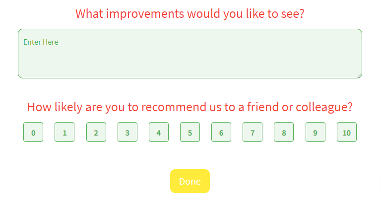
Think of where you'd put one: end of a blog post asking was this helpful?, below the pricing comparison asking what's stopping you?, after the help docs article that answered a reader's question. The survey sits where the experience already happened. That's the format's only real superpower. It captures feedback tied to a specific page, a specific moment, a specific decision.
The format is distinct from a feedback widget, which usually means a floating button or popover anchored to a page edge. Embedded means in the content, not near it.
Why Use Embedded Surveys Instead of Popups or Buttons?
Most embedded survey debates start in the wrong place. Should we use one at all? That question skips the one that actually matters: embedded versus popup versus button. The choice shapes response rate, perceived friction, and what kind of feedback you get back.
Here's where embedded wins.
1. Higher Contextual Response Rates
Embedded surveys placed in-context, like at the end of a blog post or after a help article, tend to outperform popups for engagement-aware metrics. According to published research on web survey response rates, anonymous-traffic response rates for in-app surveys typically fall in the 3-5% range, while logged-in users in product contexts can reach 60-70%. The pattern holds for embedded formats: when the survey appears where the reader already invested attention, response rates climb.
2. No Interruption of the User Journey
Popups break flow. They demand attention before the reader is ready to give it. Embedded surveys integrate with the page instead of competing with it. The visitor sees the survey when they're done reading, not when they're trying to.
This matters most on content-heavy pages where you've already earned the reader's time. Interrupting them with a modal halfway through a blog post is the fastest way to ensure they never finish either the article or the survey.
3. Continuous Feedback Without Campaign Management
Once shipped, an embedded survey runs indefinitely. No email send cadence to manage. No social campaign to refresh. The form sits there, collecting responses from every visitor who finishes the page, until you decide to change the question.
That's the difference between feedback as a campaign and feedback as infrastructure.
4. Page-Context Attribution Out of the Box
Responses are inherently tied to the page they were collected on. When a CSAT score drops 12% on the product page but holds steady on the blog, you know exactly where to look. Most embedded survey tools integrate with Google Analytics 4 or Mixpanel through event tracking, so each response carries the page URL, session ID, and any custom attributes you set.
That kind of attribution is the part most teams under-use. The data is sitting in the response. They just never wire it up.
What Types of Surveys Can You Embed on a Website?
The question types that work as embedded surveys are not unique to the format. Almost any short-form survey can be embedded. What matters is matching the question type to the context.
NPS Surveys (Net Promoter Score)
Net Promoter Score, developed by Fred Reichheld at Bain & Company, asks one question: how likely are you to recommend [product] to a colleague, on a scale of 0-10? As an embedded survey, it works best at post-purchase confirmation pages or after a meaningful product action. The reader has formed an opinion. Capture it before it fades.
CSAT Surveys (Customer Satisfaction)
A CSAT survey asks how satisfied the visitor is with a specific experience. Embed it after a support resolution page, after a key product action, or at the end of a transaction confirmation. Keep it to one question.
CES Surveys (Customer Effort Score)
CES asks: how easy was it to complete this task? It's the strongest embedded survey for friction diagnosis. Best deployed after checkout, after a self-service help article, or after onboarding milestones. CES catches problems before they show up as churn or NPS damage.
Page Helpfulness Polls
The most common embedded survey use case industry-wide. Was this article helpful? Yes / Somewhat / No. Lives at the end of blog posts and help docs. Low friction, low cognitive load, high response rate.
Exit-Intent Feedback Surveys
Triggered when the visitor moves to leave the page. Best embedded on cart pages, pricing pages, or signup flows. The question varies but usually asks what stopped them. For deeper guidance on this format, see our breakdown of website exit intent surveys.
Product Feedback Embeds
Embedded on feature documentation, release notes, or beta product pages. Asks what's missing or what the reader wishes worked differently. Useful for product teams collecting structured signal between formal research cycles.
Open-Ended Qualitative Embeds
One open text box. What can we do better on this page? Best used on low-conversion pages where you need diagnosis, not metrics. The volume will be lower than a structured question, but the responses will tell you why something isn't working.
Inline, Slide-In, Popup, or Button: Which Embed Format Should You Use?
Choose inline embed for end-of-content feedback like blog posts and help docs. Choose slide-in for product pages and dashboards where the reader is scrolling. Choose popup overlay for exit-intent triggers. Choose floating button for always-on feedback access. The decision comes down to whether you want feedback timed to a specific moment, or available the whole time.
Inline Embed
An inline embed renders inside the page's content flow, occupying its own dedicated space. The reader sees it as part of the page, not as something layered on top. Setup is usually an iframe snippet pasted into the HTML where you want the form to appear.
Best deployed at: end of blog posts, end of help docs articles, between sections of a long pricing page. Anywhere the reader has finished consuming and has formed an opinion. Response rates for inline embeds at end-of-content typically land between 2-8% for anonymous traffic.
The trade-off: inline embeds are passive. They don't trigger based on behavior. The reader either sees them or doesn't, depending on whether they scrolled far enough.
Slide-In Widget
A slide-in widget appears from the side or bottom of the screen, triggered by behavior. Usually scroll depth, time on page, or exit intent. It's less disruptive than a full popup but more visible than a passive inline embed.
Best deployed at: product pages where you want feedback after the reader explores, app dashboards where the user is logged in, or onboarding pages where you want to capture early friction. Response rates for slide-ins typically fall between 3-12%, depending on trigger timing.
Use the JavaScript embed format here, since it lets you control trigger logic. Iframes can render slide-ins but the behavior controls live in the parent page.
Popup Overlay
A popup overlay is a modal that appears above the page content, demanding attention. Most embed tools support popup overlays as a triggered behavior. Exit intent, time on page, button click.
Best deployed at: cart abandonment, pricing page exit-intent, signup flow drop-offs. Anywhere the cost of letting the visitor leave silently is higher than the cost of interrupting them. Response rates for popup overlays can reach 5-15% when triggered at the right time, and crater fast when they're not.
For a deeper look at this format, see our guide to popup surveys.
Floating Feedback Button
A small button anchored to the page edge. Usually bottom-right or side. The user clicks, the survey appears (often as an embed inside a slide-out panel). Always available, never intrusive.
Best deployed at: support pages, beta product pages, internal tools, anywhere the user might want to give feedback at an unpredictable time. Response volume is usually lower than triggered formats, but the responses tend to be high-intent. People who actively chose to complain or compliment.
For a full breakdown of the button format, see our website feedback button guide. For the broader widget category, see feedback widgets.
Quick Reference
| Format | Best For | Disruption Level | Typical Response Rate | Setup Complexity |
| Inline embed | Blog posts, help docs, end-of-content | None (passive) | 2-8% (anonymous) | Low |
| Slide-in widget | Product pages, app dashboards | Low | 3-12% | Medium |
| Popup overlay | Cart abandonment, exit intent | High | 5-15% (moment-targeted) | Medium |
| Floating button | Always-on, support pages, beta | Minimal (user-initiated) | Variable (high-intent) | Low |
The simple version: if your reader is doing something specific and you want feedback on that specific thing, pick a format that matches the context. If you want feedback at any time about anything, pick the floating button. Most teams need a mix of two.
How Do You Embed a Survey on a Website?
To embed a survey on a website: build the survey in your survey tool, choose an embed format, generate the embed code (iframe or JavaScript), then paste it into your HTML before the closing </body> tag or in your CMS's HTML block. Total setup time is usually under 10 minutes if you have access to your site's source.
The four-step process applies to almost any survey platform.
Step 1: Create the Survey
Build it in your tool of choice. For inline embeds, keep it to one or two questions maximum. The whole reason inline works is friction-free response. Adding question seven kills that.
Step 2: Pick the Embed Format
Reference the comparison above. If you're not sure, default to inline at end-of-content for your first deployment. It's the lowest-disruption format and the easiest to test.
Step 3: Generate the Embed Code
Most survey tools output one of two snippet types. An iframe snippet looks like this:
<iframe src="https://your-survey-url.com/survey-id"
        width="100%"
        height="500px"
        frameborder="0">
</iframe>
A JavaScript embed looks more like a script tag with a render function. The difference matters: iframes load the survey in an isolated frame (so it can't inherit your page's CSS, but it also can't break it), while JavaScript embeds let the survey inherit your page styles for a more native feel.
Most teams pick iframe by default. JavaScript embed becomes worth the extra setup when you want the survey to look identical to the rest of the page.
Step 4: Paste Into Your HTML
For a global embed (survey appears on every page), paste before the closing </body> tag in your site's template. For inline placement on one page, paste inside the content block where you want the form to render. CMS users on WordPress, Wix, or Webflow can paste into a Custom HTML / Embed Code block in the page editor. No developer needed.
Save and publish. The survey is live.
If you want to start with a pre-built question set instead of building from scratch, browse our website feedback survey templates.
Step-by-Step in Zonka Feedback
The flow looks the same in Zonka, with a few specifics:
-
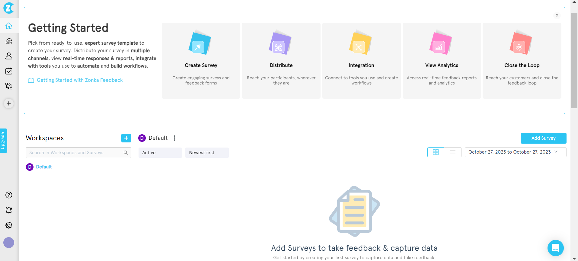
From the dashboard, click Add Survey and pick a template (or build from scratch).
-
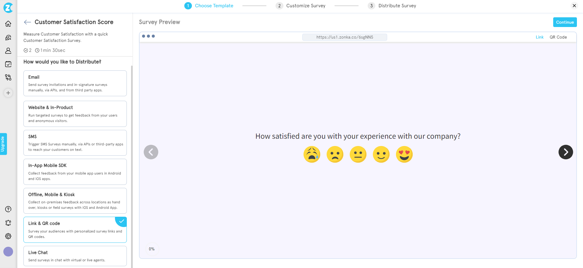
Select your survey template and choose your distribution channel.
-
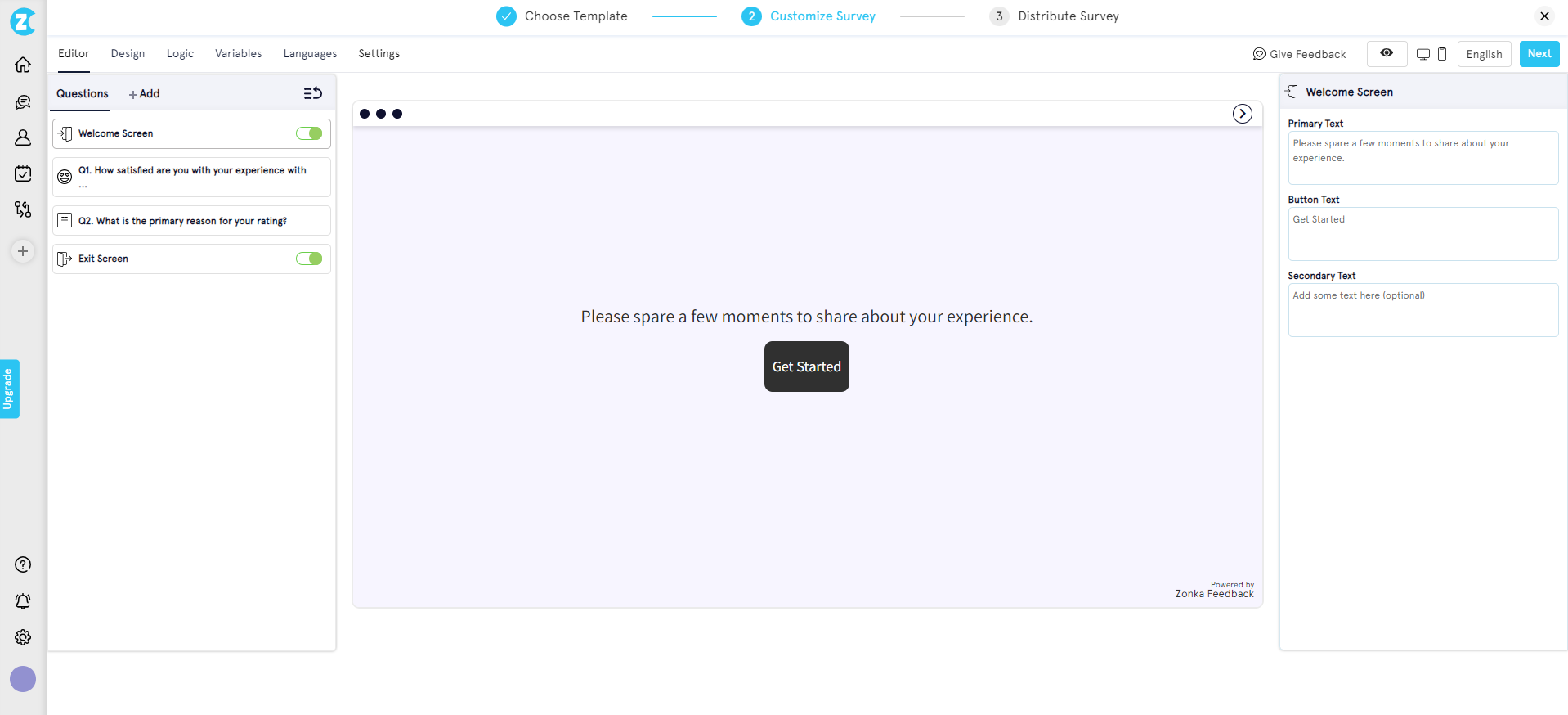
In the editor, configure questions, branching logic, and visual design. Switch the distribution channel to Embed Survey.
-
Click Configure for Embed Survey to open the embed setup.
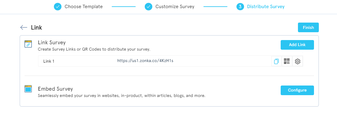
-
In the embed configuration screen, set height, width, welcome screen toggle, logo display, progress bar, and auto-close behavior.
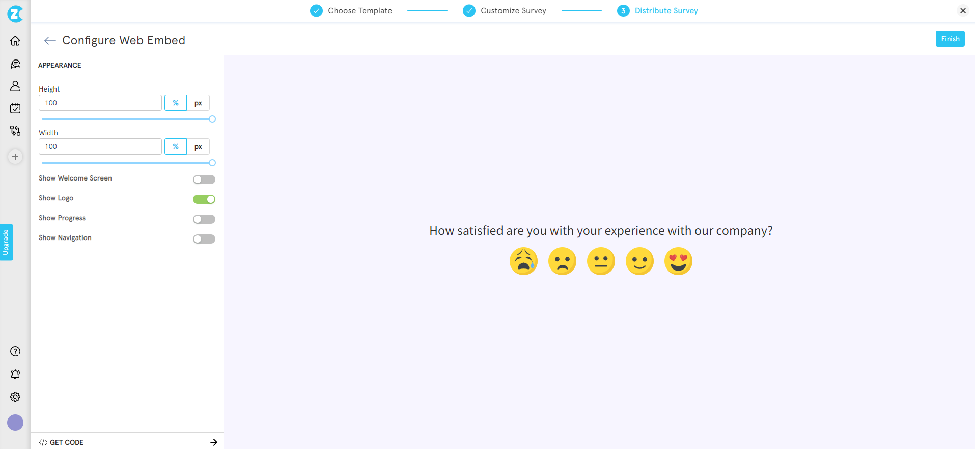
-
Hit Get Code to generate the embed snippet.
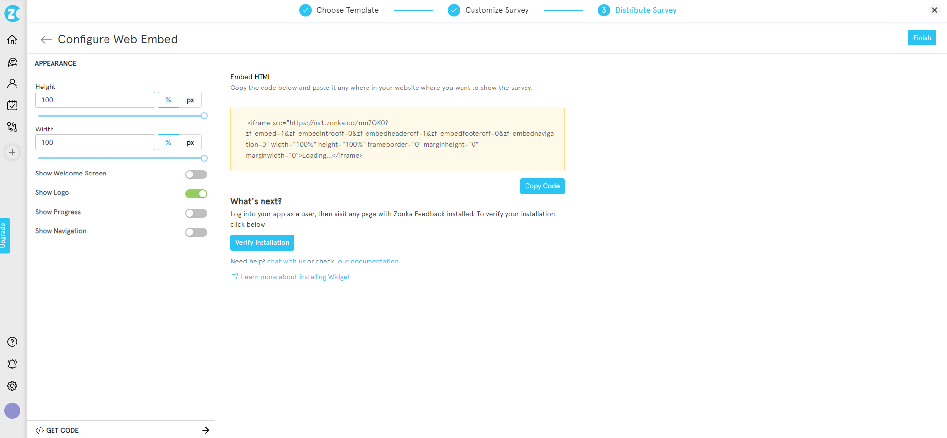
-
Copy the code, paste into your site's HTML, publish. Done.
Zonka's embed code works in any CMS, with no plugin install and no developer dependency for the embed itself.
Where Should You Place an Embedded Survey for the Best Response Rate?
Here's the part most teams skip: format choice gets all the attention, placement gets none. And placement determines whether you get responses or just a survey nobody sees.
The question to ask before pasting any embed code: what page is this for, and what does the reader feel when they finish that page? The answer tells you what to ask, where to put it, and how often to expect a response. Most placement failures come from skipping that question.
Six page-type patterns hold up across almost every site.
Blog Posts and Articles
Place the embed at the end of the article, after the conclusion. Ask one helpfulness question or one topic-suggestion question. The reader has invested 4-8 minutes in reading. They've formed an opinion. Capture it before they close the tab.
Avoid mid-article placements. They interrupt reading flow and signal that you care more about the survey than the content. The damage to bounce rate is rarely worth the marginal response lift.
Product and Feature Pages
Place the embed below the pricing block or below the feature breakdown. Ask one CES question or one open-ended what's missing? question. The visitor here is high-intent. They're in decision mode. The friction signal you get back is gold for the sales team.
Skip the survey on the hero section. Nobody wants to evaluate a product before they've read what it does.
Pricing Pages
Two good slots: between pricing tiers (asking about clarity), or after the comparison table (asking what's still unclear). Pricing pages have the highest visit-to-decision ratio of any page on the site. The friction signal is sharper here than anywhere else.
The classic mistake is putting an exit-intent popup on pricing instead of an inline. Exit intent fires after the visitor decided to leave. Inline catches them while they're still deciding.
Help Documentation
End of article, asking was this article helpful? with three choices: Yes, Somewhat, No. This is the single highest-volume embedded survey use case in the industry, and for good reason. The reader either got their question answered (or didn't). The signal is fresh.
Add a follow-up open text box that appears only when the reader picks Somewhat or No. That's where the actual diagnostic data lives. Yes is comforting; Somewhat and No are how you improve docs.
Checkout Success and Order Confirmation
Embed inline on the confirmation page, asking one CES question about the purchase experience. The emotion is positive (they just bought). The recall is fresh (the experience is still close). Response rates for confirmation-page embeds tend to outperform every other placement, because the reader is in the rare state of being both happy and unrushed.
This is also the placement most ecommerce teams forget. They'll spend a quarter optimizing the checkout flow and never ask the people who completed it what felt off.
Onboarding and Post-Signup Pages
After the first key action (first project created, first integration connected, first invite sent), embed a short CES or open-ended question. Onboarding feedback predicts churn risk earlier than any 30-day NPS survey. The friction the user hits in week one is the friction that decides whether they renew in month twelve.
Use slide-in here, not inline. Onboarding pages are short and action-driven, and an inline embed below the action competes with the next step. A slide-in triggered after action completion catches the user without blocking them.
Quick Reference
| Page Type | Best Embed Format | Question Type | Trigger |
| Blog post | Inline | Helpfulness poll | Page load |
| Product page | Slide-in | CES | Scroll 70% |
| Pricing page | Inline (between tiers) | Open-ended | Page load |
| Help docs | Inline | Helpfulness | Page load |
| Checkout success | Inline | CES | Page load |
| Onboarding | Slide-in | CES / open | After action |
If you only ship one embedded survey this quarter, ship the help-docs helpfulness poll. It's the highest-yield, lowest-risk, easiest-to-act-on placement on this list. Then build outward from there.
What's a Normal Embedded Survey Response Rate?
Embedded survey response rates typically fall between 2% and 15%, depending on format and context. Inline embeds at end-of-content average 2-8% for anonymous traffic, while behaviorally-triggered slide-ins and popups can reach 5-15% in high-intent contexts. Logged-in product contexts blow past these ranges entirely.
For anonymous web traffic (visitors landing on a public marketing or content page), the baseline is modest. According to industry research on web survey response rates, anonymous-traffic survey response rates typically fall in the 3-5% range. That's the floor any embedded survey on a public-facing page is competing against. Higher rates require either a behavioral trigger (exit intent, scroll depth, click-based) or a higher-trust context (logged-in user, post-purchase, post-resolution).
For authenticated users (visitors who are logged in to a product or members area), the picture changes completely. Research shows that surveys embedded inside web applications shown to logged-in users can yield response rates as high as 60-70%. The reason isn't magic. Authenticated users have already cleared the trust bar. The friction of responding is lower. The relationship is real.
Format and trigger choice can shift response rates by 2-3× even within the same audience. Exit-intent triggered embeds consistently outperform passive inline placement for trigger-driven feedback. Inline at end-of-content consistently outperforms mid-page placement for engagement-aware metrics. Slide-in with scroll trigger consistently outperforms slide-in with time trigger when the page is content-heavy. The patterns are stable. The format choices are the levers.
Best Practices for Embedded Surveys
A few rules hold across every embedded survey deployment, regardless of tool or format. These apply specifically to embedded formats; for the broader website surveys playbook covering popups, intercepts, and link-based formats, see our pillar guide. Skip these rules and the response rate craters; follow them and the format choice does most of the work.
- Keep inline embeds to one or two questions max. Friction kills response rate. Five questions inline isn't a survey, it's an obstacle course. If you need more depth, use skip logic — trigger a follow-up question only when the first answer warrants it, so the committed respondent goes deeper while the casual reader still gets a one-click path out.
- Match the parent page's visual design. Use a JavaScript embed if you need the survey to inherit page CSS. Use an iframe if you want isolated styling. The visual mismatch between an out-of-box widget and a polished site is the most common reason readers ignore embedded surveys without realizing they did. Custom fonts, brand colors, your own logo, and even a white-label survey domain aren't optional polish — they're what make the embed feel like part of the page instead of a third-party plugin.
- Trigger thoughtfully. Don't fire before content loads. Loading an embed before the page itself paints hurts both UX and Core Web Vitals. Defer survey embed loading until after first contentful paint. Modern survey tools support async loading by default; verify yours does. For a primer on why this matters for site speed, see web.dev's loading performance guidance.
- Test mobile rendering separately. Mobile traffic is roughly 60% of website visits globally (StatCounter, 2026). An embedded survey that renders perfectly on desktop but cuts off the submit button on mobile is a survey nobody completes. Good survey tools render responsively by default and handle iOS Safari's iframe height quirks without manual config. Still, test on real devices anyway, not just browser dev tools.
- Tie response data to page and session context for analysis. Every response should carry the page URL, the session ID, and any custom attributes (logged-in status, plan tier, traffic source, signup date). Hidden variables and contact variables let you pass this data at render time, so the response lands pre-segmented. Without that context, you have ratings without diagnoses. With it, you can answer "what's our CSAT for Enterprise-plan users on the pricing page?" instead of just "what's our CSAT?"
- Close the loop visibly. Acknowledge the response on submit. Route urgent issues (low CES, low CSAT, negative open text) to a human within hours, not days. The scale problem is that low scores alone aren't enough signal — a 4/5 with a frustrated open-text comment needs routing as urgently as a 1/5, and a detractor who mentions "cancel" needs a different workflow than one who mentions "confused." This is where sentiment analysis earns its place — reading emotion, urgency, and intent in every open-text response, so the right feedback reaches the right owner without someone manually triaging every reply. Pair that with auto-alerts to Slack or email on low scores, auto-tagging by theme, and ticket creation in Zendesk, Freshdesk, Intercom, or Jira for anything that needs follow-up. A closed-loop feedback workflow is what turns embedded survey data from a dashboard metric into actual customer experience improvement.
How Does Zonka Feedback Handle Embedded Surveys?
A quick terminology note before the specifics: Zonka treats embed and widget as two distribution methods. Embed means an inline form pasted into your HTML, the format this guide has focused on. Widgets are the rest: side tab (feedback button), popup, popover, slide-up, and bottom-bar. Both formats run off the same JS snippet, so an inline embed at the end of your help docs and a slide-up on your pricing page can live in the same workspace and ship from the same install.
A few specifics worth flagging:
-
One JS snippet per workspace, all formats included. Whether you deploy an inline embed, a slide-up, or a feedback button, the same one-line snippet handles it. Add it once to your site or push it through Google Tag Manager, then create and toggle surveys from the dashboard without re-touching code.
-
Workspaces keep environments separate. Run a marketing-site workspace, a product-app workspace, and a help-center workspace as independent units. Each gets its own JS snippet, its own active surveys, and no cross-environment widget conflicts. Within a single workspace, only one active popup, one active popover, and one active sidebar can show at a time, so multi-workspace setup matters when you want different feedback programs running on different surfaces.
-
Granular targeting and behavior without code. Target by page URL, by device (desktop, tablet, mobile), by percentage of visitors for safe rollouts, or by passed user variables (plan tier, signup date, custom attributes). Trigger on page load, time delay, scroll depth, exit intent, or click. All configured per-survey from the dashboard, no redeploy required.
-
Anonymous and identified modes. Capture feedback from public visitors anonymously when you don't have user context, or pass user variables (email, name, plan, custom IDs) when the survey runs in a logged-in environment. The mode you pick determines what segmentation and throttling are available downstream.
-
Used at scale by digital-first teams. A leading global SaaS review platform has collected 33,700+ responses via website slide-up widgets deployed across review submission, pricing, and research pages. A global eyewear e-commerce brand operating in 30+ countries lifted NPS by 30% using popups and side tabs. The same infrastructure that runs their widget programs handles inline embeds the same way.
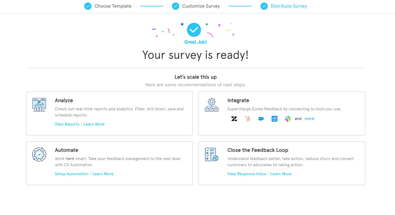
Conclusion
The format you pick depends on when you want the feedback. Inline for in-context. Slide-in for behavioral triggers. Popup for exit intent. Button for always-on. The placement determines whether anyone responds. End-of-content beats mid-page for engagement, post-purchase beats mid-purchase for honesty, behind authentication beats anonymous for trust.
If you only do one thing after reading this, ship a helpfulness poll at the end of your most-trafficked help docs article. Ten minutes of setup, the highest-yield placement on the list, immediate diagnostic value.
When you're ready to ship, Zonka's website survey software handles the embed code, mobile rendering, and response analytics so you can focus on the questions instead of the plumbing. To see the embed flow in action and request a 14-day trial, schedule a demo.


.svg)


.svg)


