.svg)
 Healthcare
 Finance
 Retail
 SaaS & Digital
 eCommerce
 Education

 Salesforce
  HubSpot
 Pipedrive
 Mailchimp
 Zendesk
  Freshdesk
 HelpScout
  Front
Front Slack
Slack  Zoom
Zoom Google Sheets
  Zapier
  Integrately
 Webhooks
  Blogs
Blogs Webinar
 Product Updates
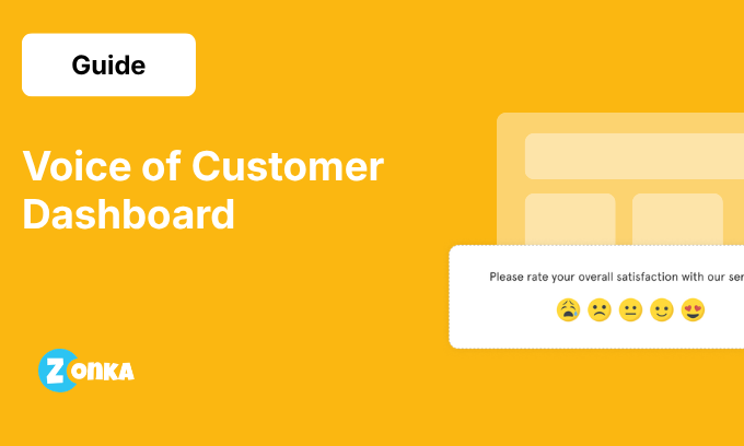


TL;DR
- A voice of customer dashboard aggregates feedback from surveys, support tickets, reviews, and conversations into one view built for decisions, unlike a static scorecard or an NPS trend line.
- Most VoC dashboards go unused because they report scores without routing them to an owner, and because aggregate numbers hide the segment-level signals that need action.
- A useful dashboard tracks lagging metrics (NPS, CSAT, CES, sentiment score) alongside leading indicators (detractor rate, net sentiment score, emerging theme rate), since most programs miss the early-warning layer.
- Split the dashboard into three role-based views: Strategic for leadership, Diagnostic for CX ops and product, and Action for support teams.
- Match dashboard complexity to program maturity, because leading indicators and role-based views need a data baseline before they work.
- Build the dashboard in a BI tool if you have engineering capacity, or buy a platform to get theme detection and multi-source unification without the pipeline work.
- Remove metrics with no owner, cross-channel sentiment averages, and low-volume themes on a regular review cycle to keep the dashboard usable.
Your team's voice of customer dashboard shows NPS, CSAT, and trend lines going back six months. The company-wide average looks stable at 4.1 out of 5. Then your highest-value account submits a cancellation request. You pull up their data: the satisfaction score was 4.2 out of 5 the week before they left.
The signal was there. The dashboard wasn't built to surface it in time.
Most VoC dashboards are built to report. They show what happened after it happened. The dashboards that catch friction early, close feedback loops before churn, and surface the right customer signal to the right team are built to route the right signal to the right team.
This guide covers what to track on a voice of customer dashboard, how to structure it across team roles, and which metrics to remove before they dilute the signal.
What Is a Voice of Customer Dashboard?
A voice of customer dashboard is a centralized view that aggregates customer feedback from multiple channels: surveys, support tickets, online reviews, and customer conversations. It surfaces what customers are telling you, in what volume, from which segments, and with which outcomes. The goal is to convert fragmented VoC data into a workspace that CX leadership, product managers, and support teams can use to make decisions.
A VoC dashboard isn't a survey scorecard or an NPS trend line. A scorecard shows how customers feel today, summarized into a number. It doesn't show what is driving that number, which customer segments are affected, or what your teams are doing about it. A scorecard is an output. A VoC dashboard is a decision-support system built from multiple feedback sources and organized for action across the entire customer journey.
The distinction matters because most teams build the scorecard version and then find that the data doesn't change anything about how the organization operates.
Where VoC Dashboard Data Comes From: Direct, Indirect, and Inferred Feedback
A voice of customer dashboard is only as useful as the data sources feeding it. Those sources fall into three groups, and a complete dashboard pulls from all three rather than leaning on surveys alone.
Direct feedback is what customers tell you when you ask. This includes survey responses, NPS, CSAT, and CES forms. It is structured, easy to score, and tied to a specific question, which makes it the starting point for most programs.
Indirect feedback is what customers say about you in public without being prompted. Online reviews, posts on social media platforms, and community forums all fall here. This data is less structured than survey responses, but it often surfaces problems before a survey would catch them.
Inferred feedback is what customer behavior reveals. Product usage patterns, records in CRM systems, support interactions, and call transcripts all carry signals about satisfaction even when no one filled out a form. This is the hardest data to read, and it is where most dashboards fall short.
Pulling from all three gives a fuller picture than any single source. It also raises a counting problem. When the same complaint shows up in a support ticket and again in a review, it should count as one issue, not two. The deduplication rule covered later in this guide keeps these data points from inflating the numbers.
Why Most VoC Dashboards Stop Getting Used
Three structural problems cause VoC dashboards to lose adoption: reporting without routing, aggregate metrics that hide the segment-level signal, and dashboard complexity that outpaces data maturity. None of them are tool failures.
Reporting without routing. The dashboard shows what happened. Scores are visible. Trends are graphed. But no one's role changes because of it. There's no named owner for the NPS metric, no team responsible when CSAT drops two points, and no process that connects VoC data to a next action. When customer feedback doesn't trigger a specific response from a specific person, it sits.
Aggregate metrics hiding the signal. A company-wide NPS of 47 looks manageable. An NPS of 47 concentrated in your top-20 accounts by revenue is a retention risk that needs immediate attention. The aggregate number and the segment-specific number tell completely different stories. When a voice of customer dashboard shows only averaged scores across the entire customer base, it obscures the pain points that actually require action. Segment context isn't optional. Without it, every key metric is potentially misleading.
Dashboard complexity outpacing data maturity. Teams often build complex dashboards before they have the data quality to support them. Role-based views require multi-source customer data with a historical baseline. Predictive signals require enough feedback volume to establish a reliable pattern. When a team sets up an advanced dashboard on six months of survey responses, the gap between dashboard complexity and underlying data quality is what causes voice of customer program failures at the infrastructure level, not the strategy level.
These are design failures, and they are fixable.
VoC Dashboard Metrics: The Leading and Lagging Split
Most VoC dashboards track lagging metrics: scores that tell you what already happened. The dashboards that catch problems before they escalate also track leading indicators: signals that tell you what is likely to happen next.
The distinction changes how useful a dashboard is in practice. A drop in NPS score tells you customers were dissatisfied. A rising detractor rate, which tracks the proportion of customers scoring 0 to 6 before the 90-day NPS score recalculates, tells you that loyalty erosion is building before it shows up in the headline score. Both belong on an effective VoC dashboard, but most programs track only one type.
Lagging Metrics
Net Promoter Score (NPS). NPS measures relationship-level loyalty by asking customers how likely they are to recommend your company on a zero-to-ten scale. It is most useful as a trend metric tracked on a 90-day rolling basis, segmented by customer tier or lifecycle stage. The aggregate number matters less than the movement across defined segments. For a comparison of dedicated collection options, see our roundup of the best NPS tools.
CSAT (Customer Satisfaction Score). CSAT measures transactional satisfaction tied to a specific customer interaction: a support resolution, an onboarding step, a product feature adoption. It refreshes weekly and is most useful when scoped to a specific touchpoint rather than averaged across the entire customer journey.
CES (Customer Effort Score). CES measures how much effort a customer had to invest to complete a specific task. It fires after defined interactions, such as resolving a support ticket or completing a setup workflow, and tells product and support teams where friction is highest in the process.
Sentiment Score. Sentiment analysis applied to open-text survey responses, support tickets, and online reviews produces an aggregate sentiment score. It refreshes weekly or monthly and gives CX leadership a read on overall customer sentiment that goes beyond what structured question scales alone can capture.
Response Rates. Response rates measure what percentage of customers complete surveys across different channels. A declining response rate is an early signal of survey fatigue or declining trust in the feedback process. Tracking it as a program health metric rather than a raw volume count keeps the VoC program honest about its own participation data.
Leading Metrics
Detractor Rate. Detractor rate is the percentage of NPS respondents scoring 0 to 6. Because individual response data is available as surveys complete, a rising detractor rate is visible weeks before the 90-day rolling NPS score reflects it. Tracking detractor rate weekly gives CX teams an earlier read on loyalty erosion than the aggregate score alone provides.
Repeat Contact Rate. Repeat contact rate tracks the percentage of customers who contact support more than once about the same issue within a defined period. A rising repeat contact rate is a reliable leading indicator of declining CES scores: customers who cannot resolve an issue in one interaction are experiencing effort that will eventually appear in satisfaction metrics.
Net Sentiment Score. Net sentiment score is the directional aggregate produced by sentiment analysis applied to open-text feedback across surveys, support tickets, and online reviews. Where NPS captures declared loyalty at a point in time, net sentiment score captures expressed emotion continuously. A declining net sentiment score across channels frequently precedes a drop in NPS and CSAT scores by several weeks.
First Contact Resolution (FCR). First contact resolution measures the percentage of customer issues resolved without a repeat contact. A declining FCR is a leading indicator of rising customer effort and support dissatisfaction: customers whose issues require multiple contacts accumulate friction that surfaces in CES and CSAT scores before it registers in aggregate satisfaction trends.
Ticket Escalation Rate. Ticket escalation rate measures the percentage of support tickets escalated to a higher tier or specialist team. A rising escalation rate signals that front-line support is encountering issues too complex or systemic to resolve at first contact, which typically drives CES and CSAT deterioration before volume is large enough to move aggregate satisfaction scores.
Emerging Theme Rate. Emerging theme rate tracks how many new or fast-growing topics appear in feedback before they show up in scores or support volume. A sudden dip in sentiment tied to a single feature, or a theme that doubles week over week, is a customer signal worth acting on early. Tracking this rate helps teams spot patterns that a fixed set of metrics would miss, because the point of the measure is to catch what you were not already watching for.
| Metric | Type | What It Signals | Refresh Cadence | Who Acts on It |
| NPS | Lagging | Relationship loyalty trend | 90-day rolling | CX Leadership |
| CSAT | Lagging | Transactional satisfaction by touchpoint | Weekly | CX Ops |
| CES | Lagging | Effort at specific interactions | Triggered | Product / Support |
| Sentiment score | Lagging | Aggregate open-text mood | Weekly | CX Ops |
| Response rates | Lagging | Survey program health | Monthly | CX Manager |
| Detractor rate | Leading | Rising 0–6 NPS share before aggregate score drops | Weekly | CX Leadership |
| Repeat contact rate | Leading | Unresolved issues ahead of CES and CSAT decline | Weekly | Support Lead |
| Net sentiment score | Leading | Directional sentiment shift across feedback sources | Weekly | CX Ops |
| First contact resolution (FCR) | Leading | Declining FCR signals rising effort before CSAT drops | Weekly | Support Lead |
| Ticket escalation rate | Leading | Systemic issues surfacing before satisfaction score impact | Weekly | CX Ops / Support |
| Emerging theme rate | Leading | New or fast-growing themes before they hit volume or scores | Real-time / weekly | CX Ops |
Most programs start by tracking all five lagging metrics and zero leading indicators. The result is that teams see the NPS drop after the problem has compounded over weeks. The practical starting point is to track NPS and CSAT from the beginning and add detractor rate as the first leading indicator once NPS survey volume is sufficient to track weekly trends. Build from there as your voice of customer metrics program matures. A deeper voice of customer analytics layer follows once feedback volume supports it.
How to Structure a Voice of Customer Dashboard: 3 Views, Not One
Structure a voice of customer dashboard in three views: a Strategic view for CX leadership, a Diagnostic view for CX ops and product managers, and an Action view for support teams. Each view draws from the same feedback data, organized for a different decision.
The most common structural mistake in VoC dashboard design is building a single view for every audience. When a CCO and a frontline support agent are looking at the same screen, one of them is looking at the wrong data. The same underlying customer data should render differently depending on who needs to act on it and how quickly.
A practical structure divides the dashboard into three views. Each view draws from the same data sources: survey responses, support tickets, online reviews, call transcripts, and CRM systems. Each is organized for a different decision type.
View 1: Strategic View
Purpose: A real-time health snapshot for CX leadership, formatted for a fast read.
Components:
- NPS and CSAT trend, month over month
- Top three movements in customer sentiment themes
- Closed-loop resolution rate: the percentage of flagged issues resolved within the defined SLA
- Segment or regional breakdown for multi-location or multi-product operations
Refresh cadence: Weekly, with real-time alerts configured for critical score changes.
What it answers: Are experience scores improving or declining across the customer base? Which customer segments or regions are driving the movement?
View 2: Diagnostic View
Purpose: Identifies what is driving customer sentiment to move. Used by CX ops teams and product managers.
Components:
- Theme volume by channel source: kiosk feedback captures in-location sentiment at the moment of transaction, WhatsApp captures post-service reflection, in-app surveys capture product-moment experience, and email captures relationship-level NPS
- Channel context alongside theme: a complaint about "wait times" from a kiosk is a location staffing issue routed to the ops manager. The same complaint from an in-app survey is a booking flow issue routed to the product team. The channel determines which team owns the fix.
- Segment breakdown by customer tier, location, or department
- Root cause by theme category
- Touchpoint-level CSAT mapped to the customer journey
- Emerging themes: new or fast-growing topics flagged before they register in volume, so teams can investigate early rather than after the trend has compounded
Refresh cadence: Daily for CX ops. Bi-weekly for product managers, aligned with sprint planning.
What it answers: Which themes are growing in volume? Which customer segments are affected? Which channel is generating the feedback, and which team does that route to?
View 3: Action View
Purpose: Accountability layer. Converts the signals surfaced by the Diagnostic View into assigned tasks with SLA tracking.
Components:
- Open issue queue with named owner per issue
- Current status and SLA progress for each open item
- Resolution rate by team and category
- Post-resolution sentiment recovery: tracking whether fixing a reported issue moved satisfaction scores in the affected segment
Refresh cadence: Real-time.
What it answers: What is each team doing about the issues the Diagnostic View surfaced? Is the resolution producing the expected improvement in customer sentiment?
What Changes When Feedback Comes from Multiple Channels and Locations
The three-view structure works for a single-product team with one support queue. When feedback is coming from kiosks, WhatsApp, in-app surveys, and email across 50 branches simultaneously, the structural challenge is different. The Diagnostic View needs to answer more than "what is the theme." It also has to answer "which channel, at which location, routed to which team."
Consider a retail or healthcare operation with branches across multiple cities. The same complaint, "wait times are too long," lands differently depending on where it came from. From a kiosk at a specific branch, it is a staffing or floor operations issue that routes to the branch manager. From WhatsApp after a service interaction, it is a service delivery issue that routes to the customer success team. From an in-app survey, it is a booking or workflow issue that routes to the product team. From an email NPS survey, it reflects relationship-level frustration that routes to CX leadership. Same theme. Four channels. Four owners. A dashboard that aggregates by theme without preserving channel context flattens that distinction and routes nothing to anyone.
This is where entity mapping becomes operational rather than architectural. Entity mapping connects each feedback item to the specific location, channel, agent, or service unit it came from. Zonka Feedback handles this automatically: a branch manager in Delhi sees kiosk and WhatsApp signals from their location, the regional head sees patterns aggregated across eight branches with a channel breakdown, and the CCO sees the full picture organized by the business structure operations already uses. Anomaly detection flags an emerging theme, such as a sudden dip in one location's scores, before it builds enough volume to move the aggregate.
Deduplication rule: When the same customer complaint appears in a WhatsApp message and a support ticket, it counts as one driver in the Diagnostic View, not two. Count by customer, not by source. Teams that count by source rather than by customer inflate theme volume and misprioritize their response effort.
This connects directly to the voice of customer framework your organization uses for collection and analysis. It is also one of the foundational decisions that shapes how you build a voice of customer program from the ground up.
A VoC Dashboard in Action: One Signal, End to End
The three-view structure is easier to understand with a single example that moves through all three views. Here is how one issue travels from first signal to confirmed fix.
A software company ships an update to its billing flow. Within days, the Diagnostic View shows a new theme forming. Complaints about the billing step are up sharply, and net sentiment on that topic has turned negative. The detractor rate among customers who touched the new flow is climbing faster than the overall NPS trend, which still looks stable even though the affected accounts represent meaningful revenue exposure. The aggregate score hides the problem. The Diagnostic View surfaces it.
The theme carries channel context. Most of the complaints come from in-app surveys tied to the checkout step, which points to a product issue rather than a support or billing-team issue. The Diagnostic View routes it to the product team.
In the Action View, the theme becomes an assigned task. A named owner on the product team picks it up, with a due date and an SLA. The status moves from open to in progress. Everyone looking at the dashboard can see who owns the fix and where it stands, so the issue does not sit unattended for weeks.
The product team ships a correction, and the Strategic View closes the loop. Over the next two weeks, the detractor rate on the billing theme falls back to its earlier level, CSAT on the checkout step recovers by several points, and complaint volume on the topic drops. Post-resolution sentiment recovery confirms the fix actually worked.
One signal, three views, a measurable outcome. That is the difference between a dashboard that reports and a dashboard that drives real business outcomes. Without the routing and the ownership layer, the same billing complaints would have stayed as a line on a chart until account cancellations made them impossible to ignore.
Building a VoC Dashboard at Your Current Program Stage
Match the dashboard to your program's maturity. In the first six months, track NPS and CSAT trends with a handful of themes. Between six and eighteen months, add the first leading indicators and a diagnostic layer. After eighteen months, add role-based views and an ownership layer.
The three-view structure described above is the destination, not the starting point. Building a Stage 3 dashboard on Stage 1 data doesn't accelerate a VoC program. It creates a gap between dashboard complexity and the data quality needed to support it, and that gap is what causes teams to stop using it.
Here is what a VoC dashboard should include at each stage of program maturity.
Stage 1: Listening (0–6 months)
Data available: Survey responses, basic support ticket tagging.
Track: NPS trend, CSAT at two or three defined touchpoints, top five themes from open-text responses using manual review or basic text classification.
Skip for now: Leading indicators (no baseline exists to measure velocity against), role-based views (over-engineered for the available data), entity mapping (insufficient volume to generate reliable patterns).
Goal: Establish that feedback data is consistent, visible, and worth acting on. The benefits of a voice of customer program become visible to the organization only once the data is credible enough to inform a decision.
Stage 2: Understanding (6–18 months)
Data available: Surveys, support tickets, and online reviews unified in one view.
Track: Full lagging metric suite plus the first leading indicators: detractor rate and repeat contact rate. Add segment views organized by customer tier, product line, or location.
Add now: The Diagnostic View. Build root cause analysis into the theme layer. Begin tracking response rates as a program health metric alongside satisfaction scores.
Goal: Move from describing what customers feel to diagnosing why they feel it. Voice of customer examples at this stage typically show clear links between theme movements and specific product releases or service changes.
Stage 3: Acting (18+ months)
Data available: All feedback sources unified, historical baseline established, CRM systems providing segment and revenue context.
Track: Full leading and lagging suite. Resolution rates. Post-fix sentiment recovery. AI-surfaced signals that route to specific team members based on their role and scope.
Add now: The Action View with ownership layer. Configure threshold alerts on leading indicators so teams receive a notification when a metric crosses a defined boundary without needing to check the dashboard manually.
Goal: Customer feedback drives team behavior on a continuous basis rather than only at scheduled review cycles.
Which Teams Use Which Views
Each role needs a different view. CX leadership uses the Strategic view weekly, CX ops and product managers use the Diagnostic view daily to bi-weekly, support leads use the Action view daily, and frontline agents see only the CSAT scores tied to their own interactions.
One dashboard shared across every team is effectively no dashboard for any specific team. The role of each user determines which view they need, how often they need it, and what level of detail is appropriate.
| Role | Questions They Need Answered | Dashboard View | Refresh Cadence |
| CCO / CX Head | Are scores improving or declining? Where is the largest risk by segment or region? | Strategic | Weekly |
| Regional Manager | Which branches are underperforming? Is a complaint pattern appearing across multiple locations in my region? | Diagnostic (region-filtered) | Weekly |
| Branch / Store Manager | What are customers saying about this location? Which channel is generating the most negative feedback here? | Diagnostic (location-filtered) | Daily |
| CX Ops Manager | Which themes are growing? Which customer segments are generating negative sentiment? | Diagnostic + Action | Daily |
| Product Manager | Did a recent release change NPS, CES, or complaint volume for a specific feature? | Diagnostic (feature-filtered) | Bi-weekly / sprint |
| Support Lead | Which issue categories are reopening? Where is friction highest in support interactions? | Action + real-time signals | Daily |
| Frontline Agent | What satisfaction scores are customers giving based on their specific interactions? | Agent-scoped CSAT only | Daily |
The frontline agent row has a specific implication. An agent looking at company-wide NPS has no path to affect it. An agent looking at CSAT scores tied to their own customer interactions can adjust their behavior based on what they see. That scoping is what turns customer sentiment data into a behavior change at the individual level, rather than a number that everyone sees but no one owns.
This role-based structure reflects what voice of customer programs need to function across an organization: the right signal surfaced to the person accountable for it. A branch manager in one city sees kiosk and WhatsApp signals from their location only. A regional manager sees those signals aggregated across the branches in their region, with a channel breakdown that tells them whether a complaint pattern is isolated to one location or systemic across all of them. The CCO sees the full picture. Zonka Feedback is built around this architecture, where each role's view is scoped to their operational responsibility rather than a single shared dashboard that gives everyone the same data and therefore guides no one specifically. This connects to the VoC strategy and best practices principle of organizing signal delivery by accountability, not by reporting hierarchy.
Build a VoC Dashboard In-House or Buy a Platform
Build in-house with a BI tool if your team has data engineering capacity and mainly needs custom reporting. Buy a dedicated platform if you need feedback unified, classified into themes, and routed to teams without maintaining the pipeline yourself.
Most teams reach a point where they have to decide whether to build the dashboard themselves or use a dedicated platform. Building it in a BI tool like Looker or Tableau gives full control over the layout, but it also means owning the hard part underneath. That includes pulling feedback from every channel, classifying open text into themes, connecting each theme to segment and revenue data, and keeping all of it current as sources change. For most teams, that is a months-long engineering project with ongoing upkeep. Other teams try to assemble a dashboard from point solutions, running standalone NPS software for scores and a separate tool for theme analysis, but that approach recreates the same silos the dashboard was built to remove.
A dedicated platform handles the data layer for you, with theme detection and multi-source unification built in. The tradeoff is setup time and fitting a new tool into your stack. If you are mapping the broad landscape first, our roundup of customer feedback tools covers the full category. To narrow the choice to VoC specifically, our guide to platforms to build and run a Voice of Customer program covers what to look for at each stage of program maturity.
VoC Dashboard Hygiene: What to Remove Before Adding More
Dashboards accumulate metrics over time. A metric gets added for a quarterly business review and never removed. A chart gets built to answer a one-time question and becomes permanent. After 12 months, most VoC dashboards contain more data than anyone checks regularly and fewer signals than anyone acts on.
Maintaining accuracy in a VoC dashboard requires the same discipline as adding to it: a regular review of what to remove.
Overall average sentiment across all channels combined. When positive survey responses from one channel are averaged together with negative reviews from another, the result describes no actual customer segment accurately. Segment-specific sentiment is useful for identifying where to focus. Cross-channel averages without segment context aren't.
Response volume without response rate context. A count of 800 survey responses sounds healthy. If your customer base grew from 2,000 to 20,000 over the same period, your response rate dropped from 40% to 4%. Volume alone is a misleading metric. Response rates give the correct picture of participation health.
Metrics with no named owner. If no specific person or team is accountable for a metric on the dashboard, removing it is the correct action. A metric without an owner occupies visual space without driving behavior.
Themes below statistical significance. Five mentions of a minor interface preference over 90 days isn't a theme that warrants a slot in the Diagnostic View. Setting a minimum volume threshold for any category to appear in the theme layer, and enforcing it consistently, keeps the view focused on patterns that are actually representative of customer needs.
Year-over-year NPS without segment breakdown. A two-point improvement in aggregate NPS over 12 months can occur simultaneously with a 14-point decline among your top-tier accounts. The macro trend hides the segment-level risk. Aggregate year-over-year NPS without a breakout by customer tier or region doesn't give CX leadership the information needed to spot patterns that require action.
The test for any metric on a VoC dashboard: if this number changed by 20% in either direction tomorrow, would a specific team do something different? If the answer is no, the metric should be reviewed for removal. One more discipline keeps a dashboard alive: attach it to a decision people already make. A dashboard reviewed every week before a standing planning meeting stays in use, while one people open when they have time quietly gets abandoned.
Getting More from Your VoC Dashboard
The most effective VoC dashboards are usually simpler than the ones that stopped being used. They track fewer metrics, assign clear ownership to each one, and organize the data around the decisions that each team actually needs to make.
The question worth asking before your next dashboard review isn't what to add. It is: which metric on the current dashboard, if it changed significantly, would cause a specific team to take a specific action? Start there, and build the dashboard around the answers.
Ready to see how role-based dashboards can power the three-view structure described here? See Zonka's role-based dashboards


.png)